Bad Doggie!
I was not happy with the Pioneer Press's front page infographic today, so I wrote this letter to the editor. If you would like more information about why this graphic is wrong, I recommend reading Edward Tufte's excellent book, The Visual Display of Quantitative Information. For the budget figures themselves, see Bush's 2005 and 2006 budgets.
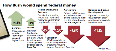
Bad Budget Infographic
I was disappointed with the Pioneer Press's front page infographic about President Bush's budget (February 8). Because of its shoddy design, it gave readers a false impression of the relative impact of Bush's proposals on the budget as a whole. First, the graphic depicted a one-dimensional number (the percentage increase or decrease) as a two-dimensional arrow, with larger percentages represented by longer and wider arrows. This gives a mistaken impression of the relative difference between the numbers. Second, presenting the budget numbers as percentages without showing the size of each program creates a false equivalency. In dollar terms, an 11.5% cut in Housing and Urban Development ($2.8 billion) is small compared to a 4.5% increase in military spending ($17.6 billion). Showing such a large representation of a relatively small cut gives the false impression that Bush's budget will make a real difference in reducing the size of the federal deficit, which it will not.
posted by Luke Francl @ 1:17 AM |
| ![]()
![]()


1 Comments:
More to the point, so many down arrows give the impression of expense cutting when the new budget is actually larger.
However, what Luke fails to grasp is that that budget is only half the story in terms of the federal budget (the other half being revenues.) While the infographic is clearly misleading, so is Luke's statement.
The infographic makes no mention of deficit reduction at all, only budget changes.
Post a Comment
<< Home